Bringing an unconventional LSAT study method from paper to screens
I worked with the author of a best-selling LSAT book to expand her tutoring business into the digital space, balancing her brand’s playful personality with an intuitive study experience.
My Role
UX, UI, Art Direction, Illustration
Timeline
6 months (Fall 25 – Spring 26)
Industry
E-learning
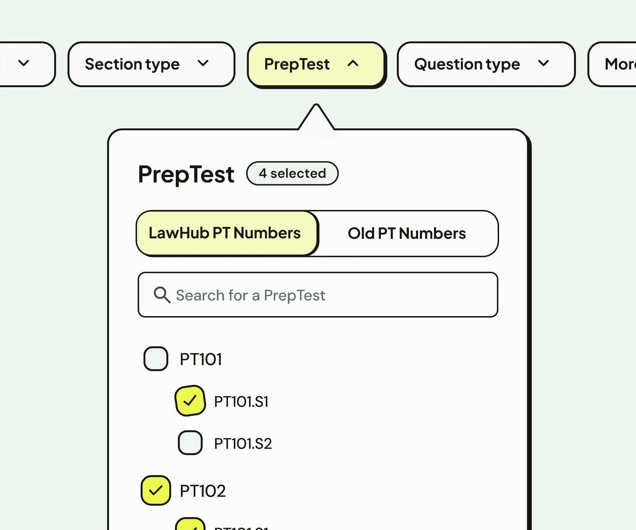
Filtering questions by LSAT practice test, and checking answers
Results
450+ paid users and high perceived value a few months post-launch
Before I joined the project, he Loophole asked current students what they'd be pay for platform. After using the finished site, some realized they'd lowballed their estimate.
“The website is a stunner... I think my max price per week that I’d pay [for this] was way low.”
Problem
The existing digital experience was confusing and generic.
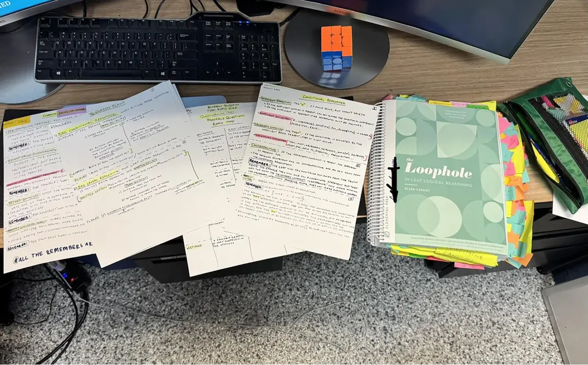
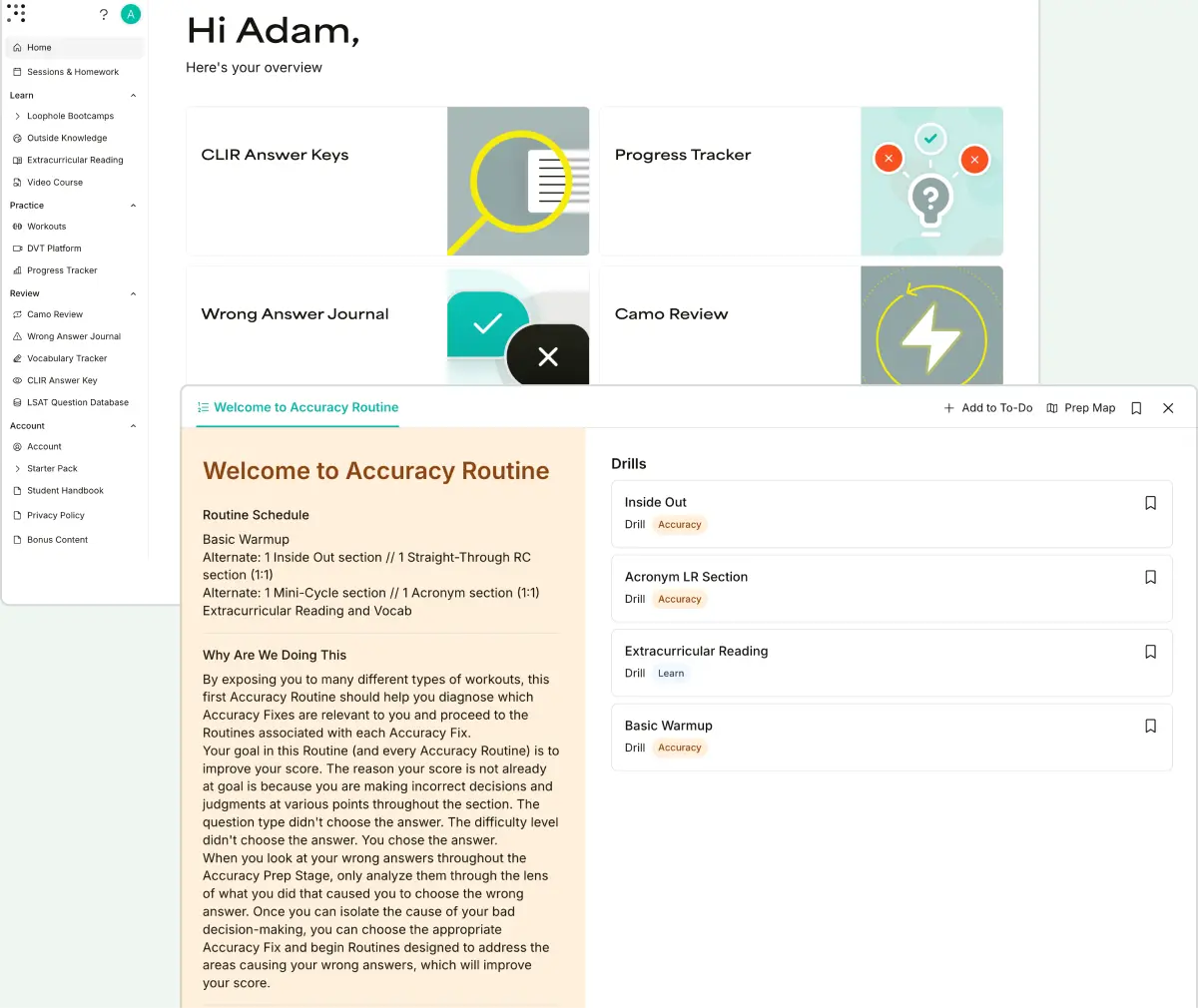
When I joined the project, the Loophole had already established an online hub. But students were finding it difficult to do the things they’d easily done on paper, like record their wrong answers. Plus, the site itself was plain, a total mismatch for a study method with an almost cult-like following.
The paper study method
The existing online platform
Challenge
Bring the Loophole method online with a study exeprience that balances self-direction and structure
The first release targeted students already familiar with the Loophole but who were supplementing their studying with other online resources. The digital platform needed to feel like natural extension of that method, creating a cohesive experience across all brand touchpoints.
However, the team didn't have a license to display official LSAT practice questions, so the platform had to add value to studying that still happened off-screen. And because students were used to following a structured study plan, we needed to make sure the online platform's more self-paced approach still offered guidance.
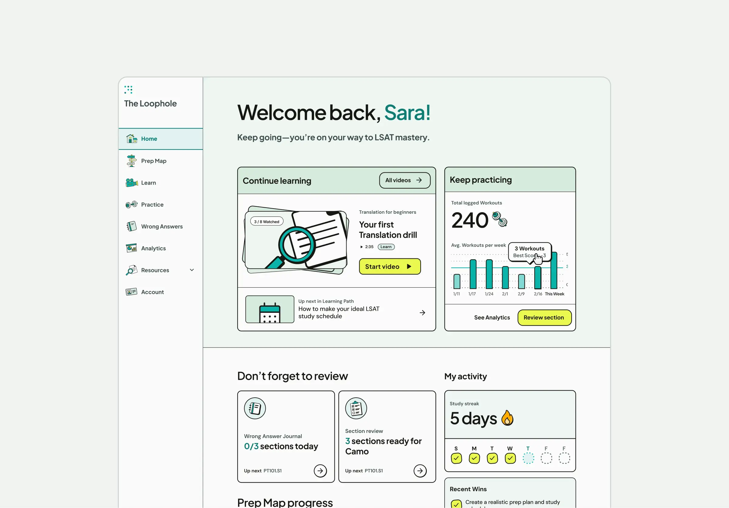
Loophole home screen
Art Direction
A playful visual style that balances personality with clarity
The Loophole was missing out on key opportunities to put their brand out there. They positioned themselves as a fun alternative to traditional dry, stress-inducing study methods, but this personality only existed within the book's pages.
I brought their quirky voice to life with bold, sticker-like illustrations and components that mimic analog study tools. I designed the experience around a gym metaphor to emphasize that while the LSAT feels intimidating, consistency leads to results.
Features
Pratice drills and progress tracking, for drills that must be done offline
Choosing and completing the right practice drill, without external guidance
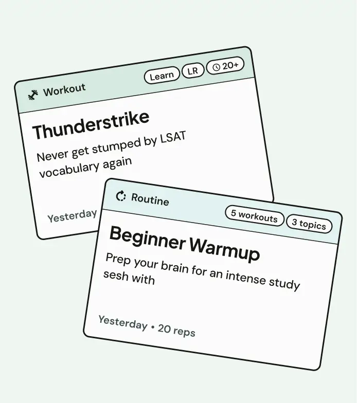
The existing study method was prescriptive: students completed exercises, or "Workouts," assigned from the book or private tutoring. We built our experience around organization and information to help them discover the right exercises for their needs and complete them effectively.
01
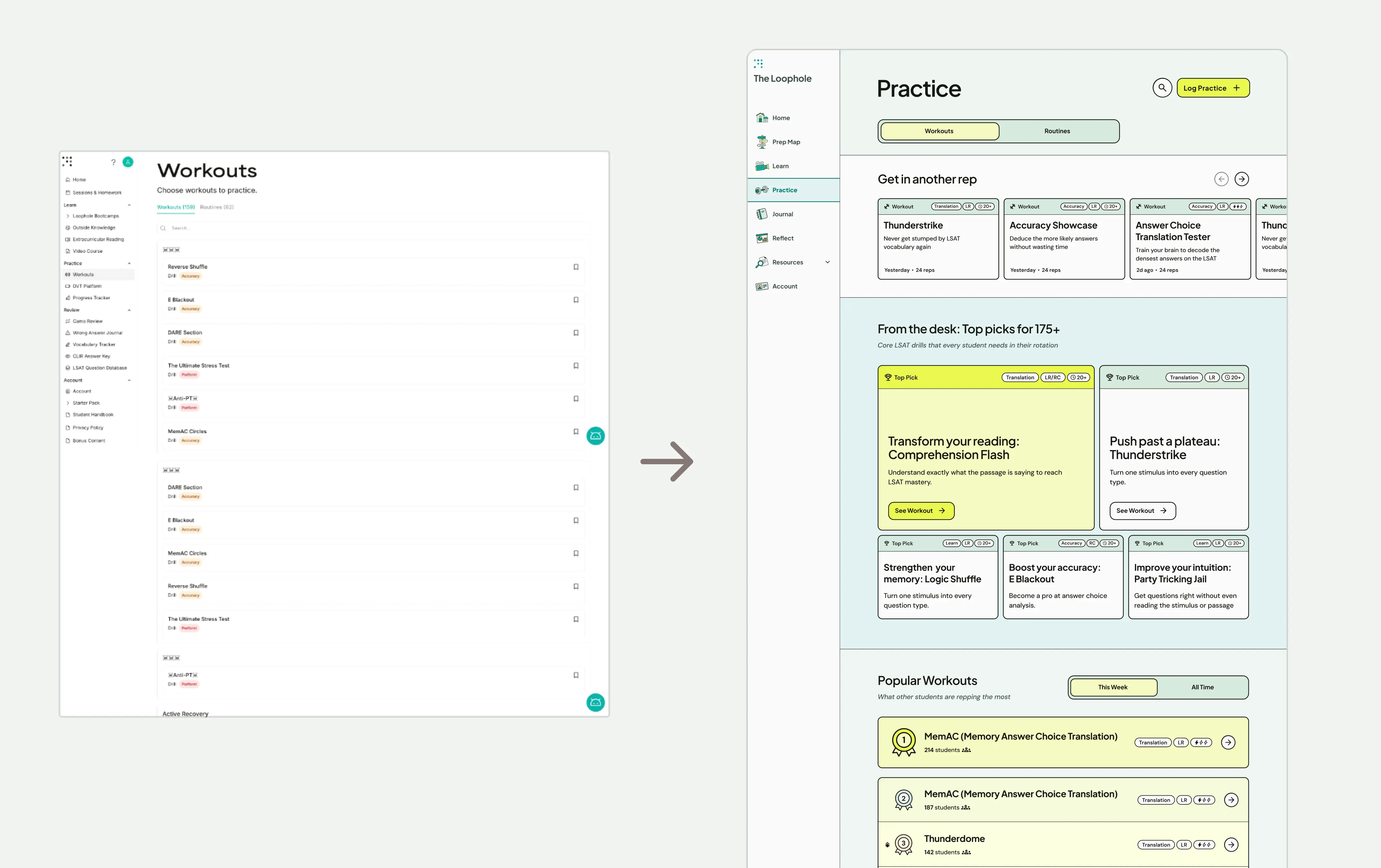
Before (left) vs after (right). I replaced the long, unsorted list with scannable cards showing what each workout helps with, then grouped them by popularity, study area, and recency.
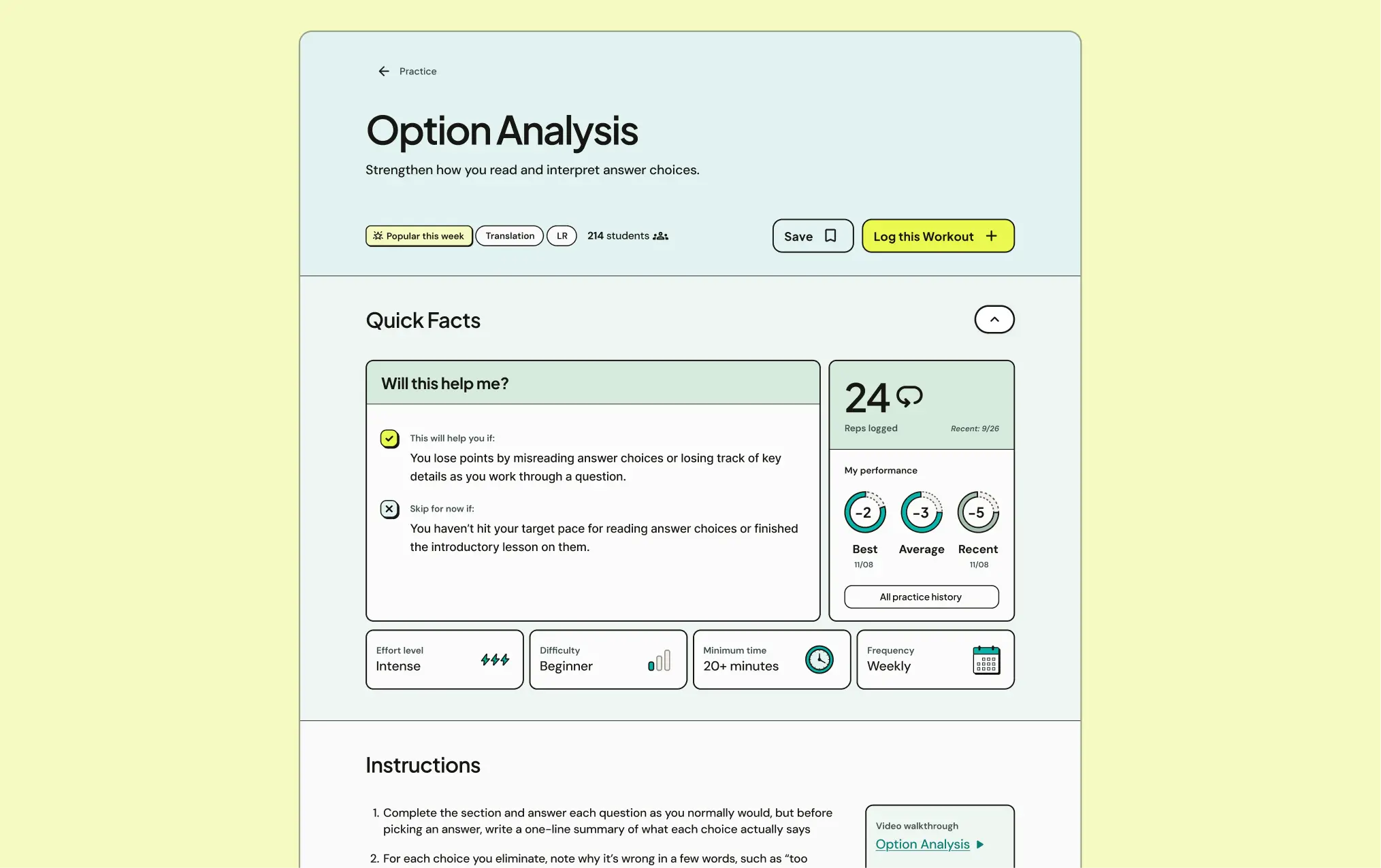
New workout details page. I added in practice history and scannable information to provide more context around the exercise.
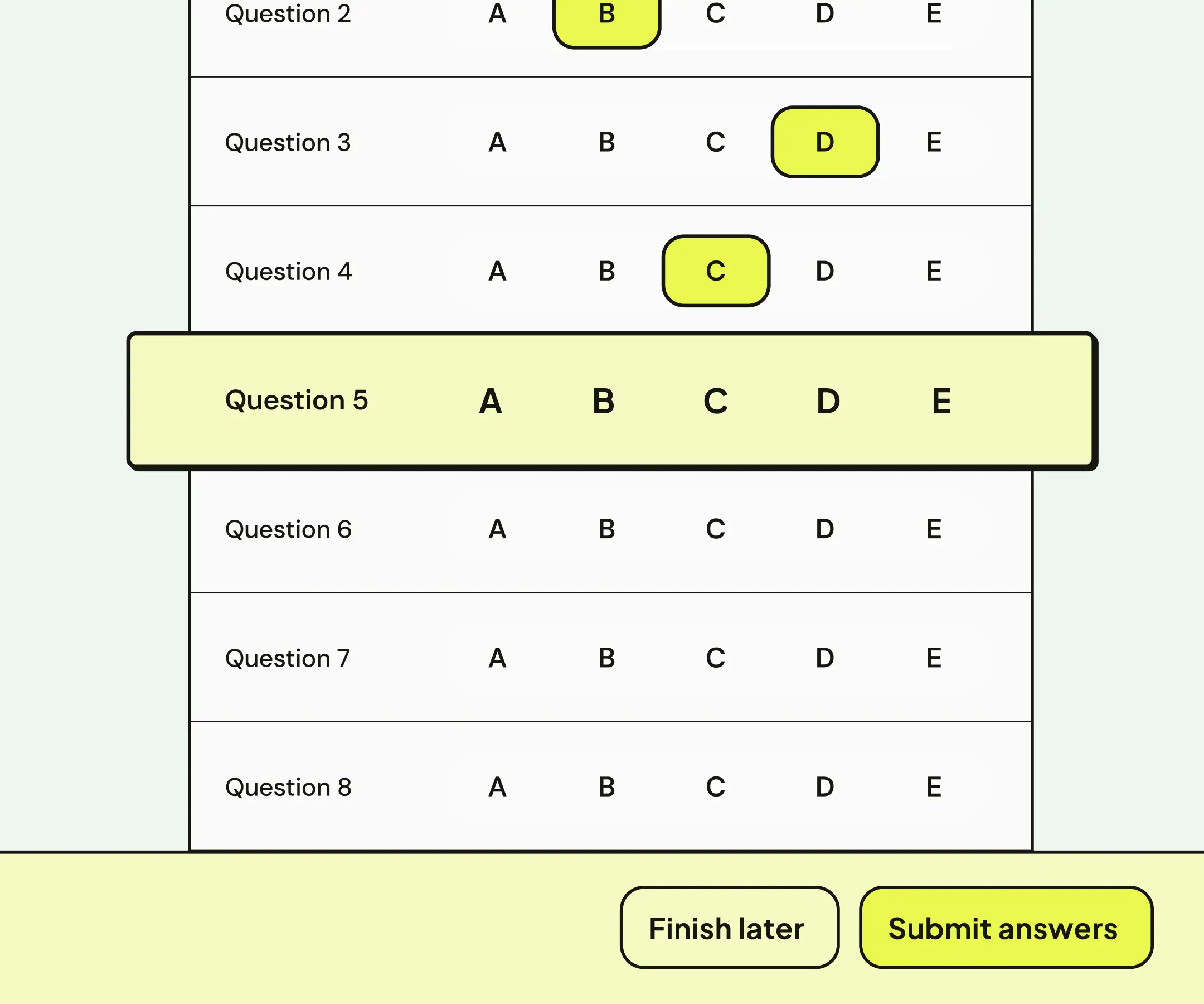
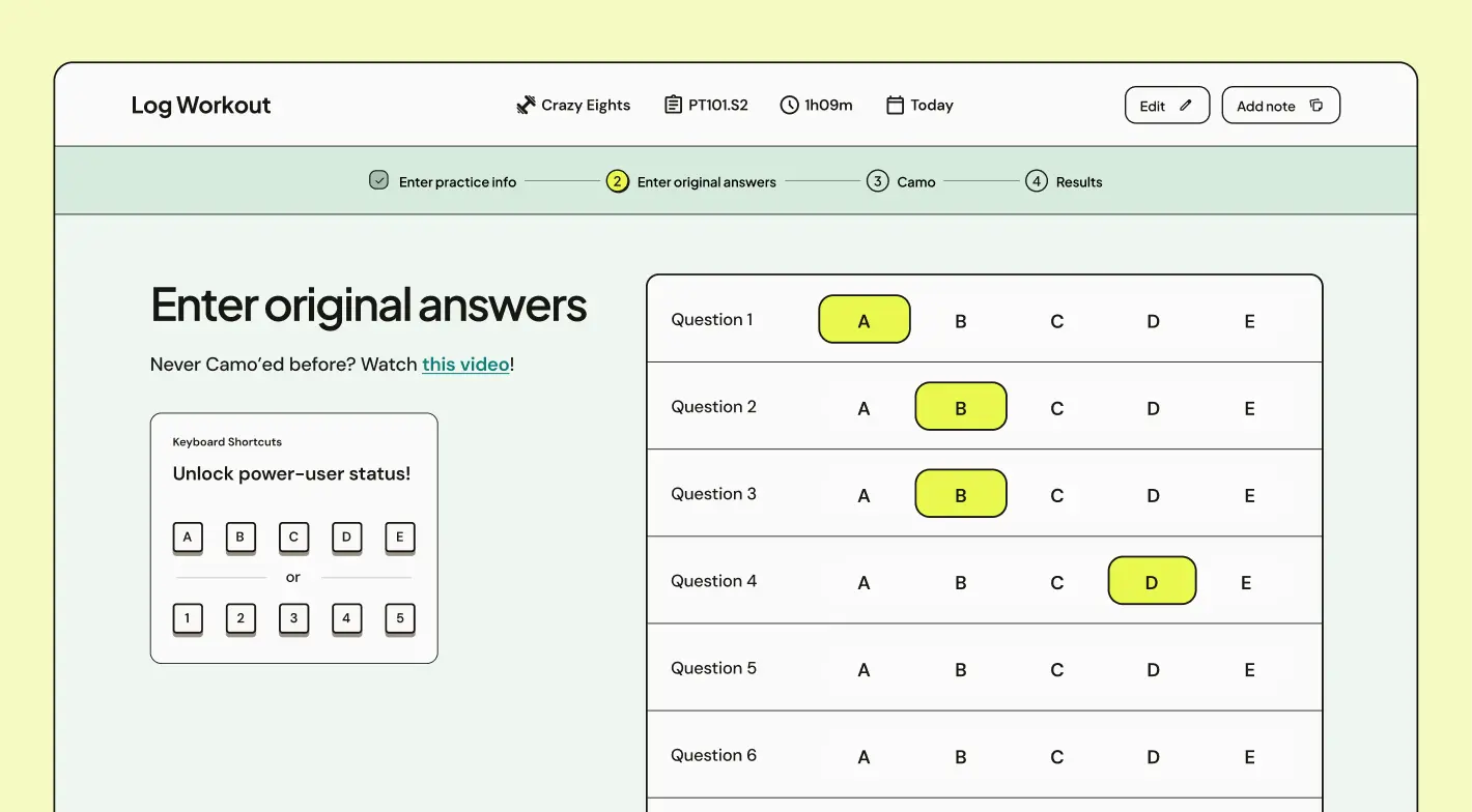
Answer logging quick enough for students to actually do it
Students found uploading answers tedious, but without a testing platform, it was the only way to collect data on their progress. Plus, it enabled a signature Loophole method, where students redo incorrect answers without knowing if they got it right or wrong. With these considerations, I designed a flow that focused on efficiency.
02
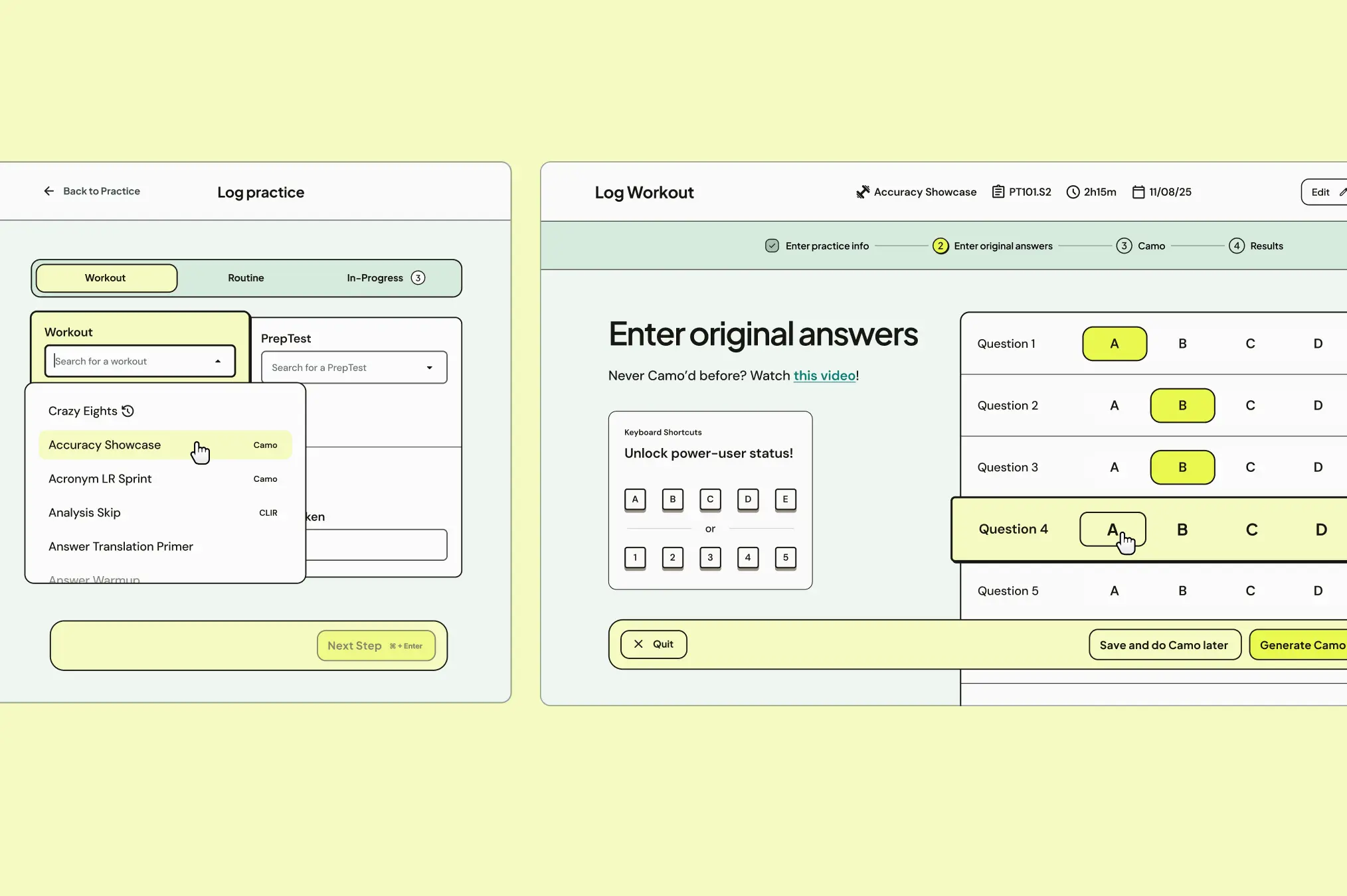
The logging interface took inspiration from Scantrons, while keyboard shortcuts and auto-advancing keep input quick.
A dashboard students want to check, based on what tutors know matters
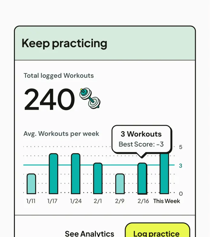
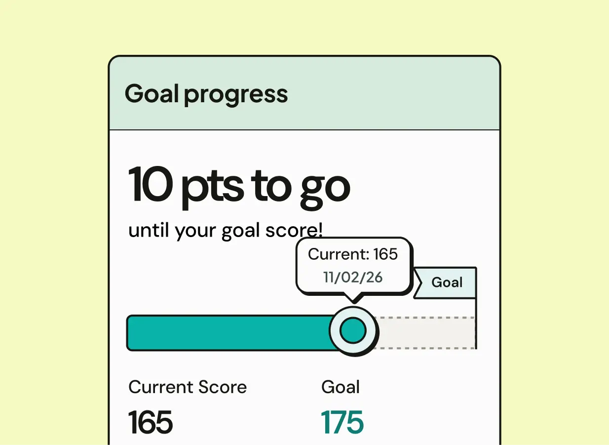
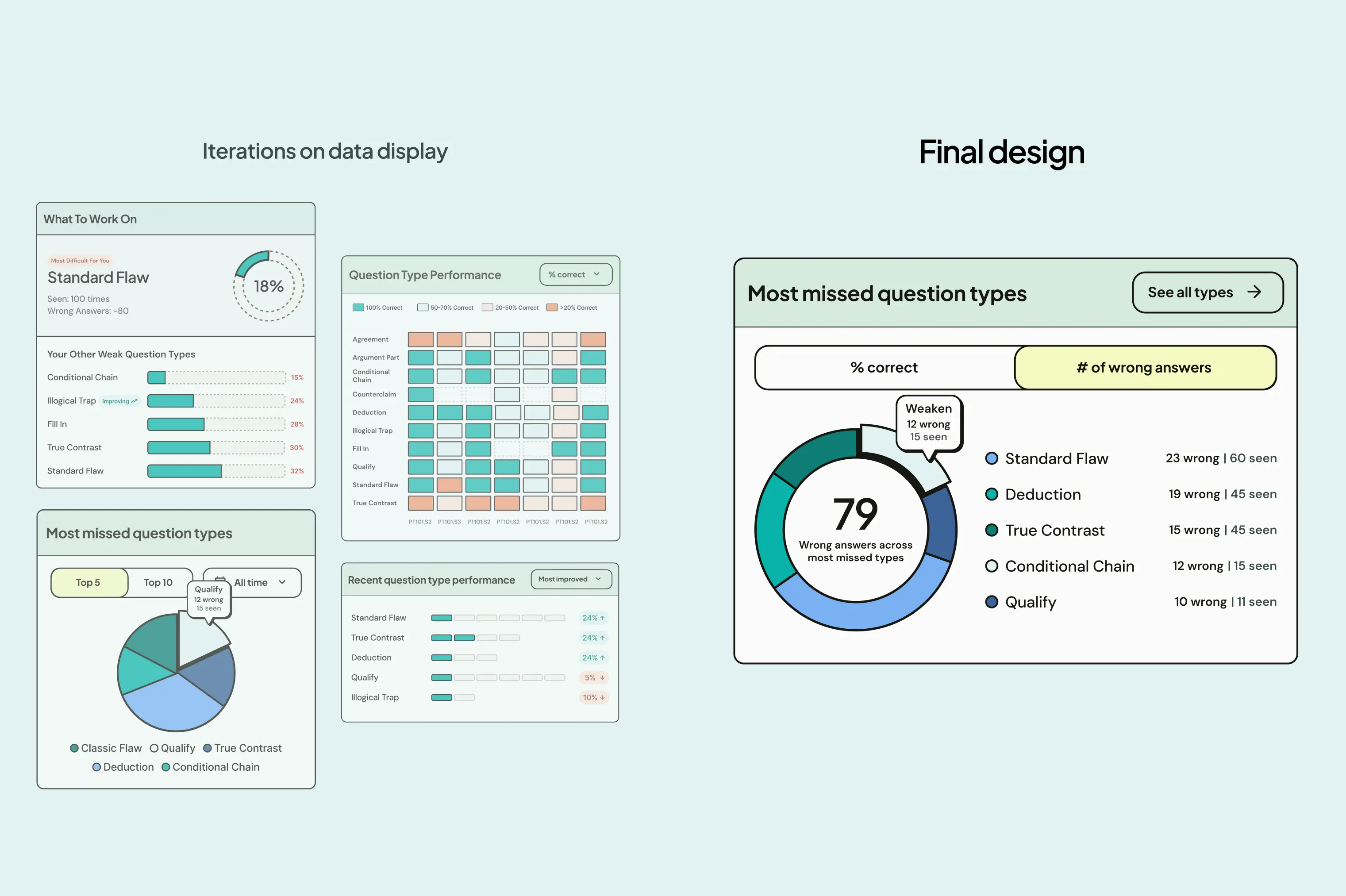
Analytic dashboards were a big part of why students were turning to other platforms. We talked to students to learn what they wanted to see, and with tutors to discover what information actually helped them improved. With this understanding, we designed a dashboard that balances visual appeal with useful insight.
03
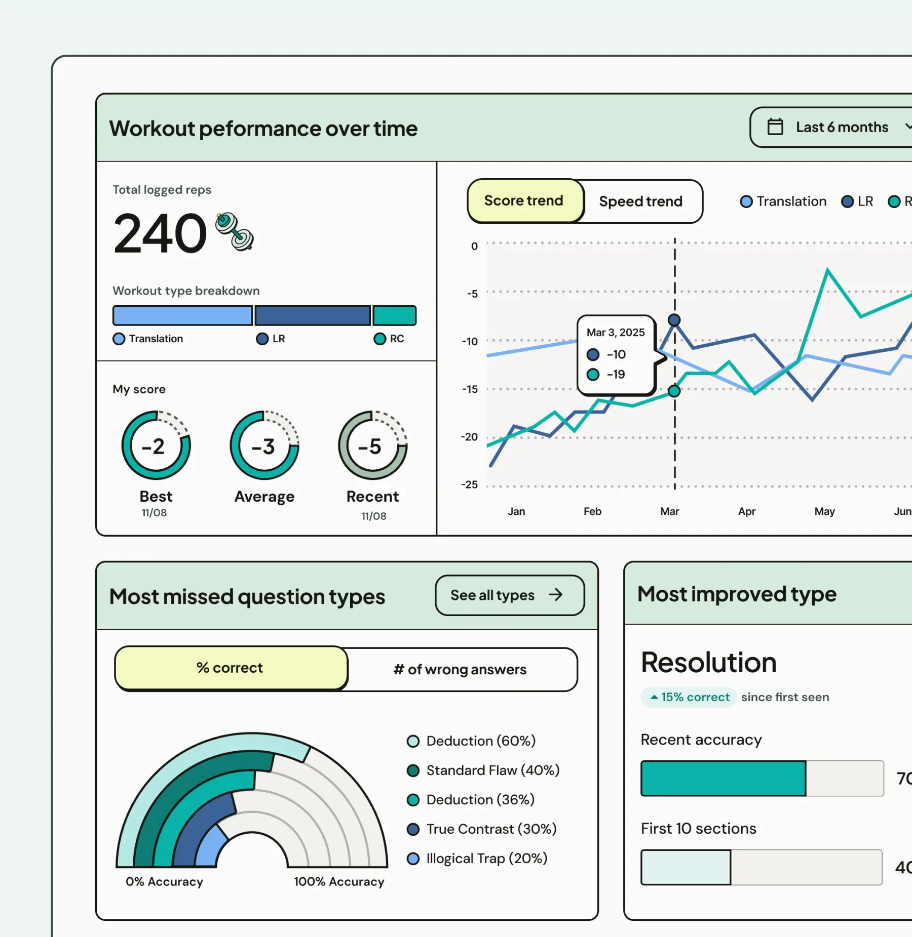
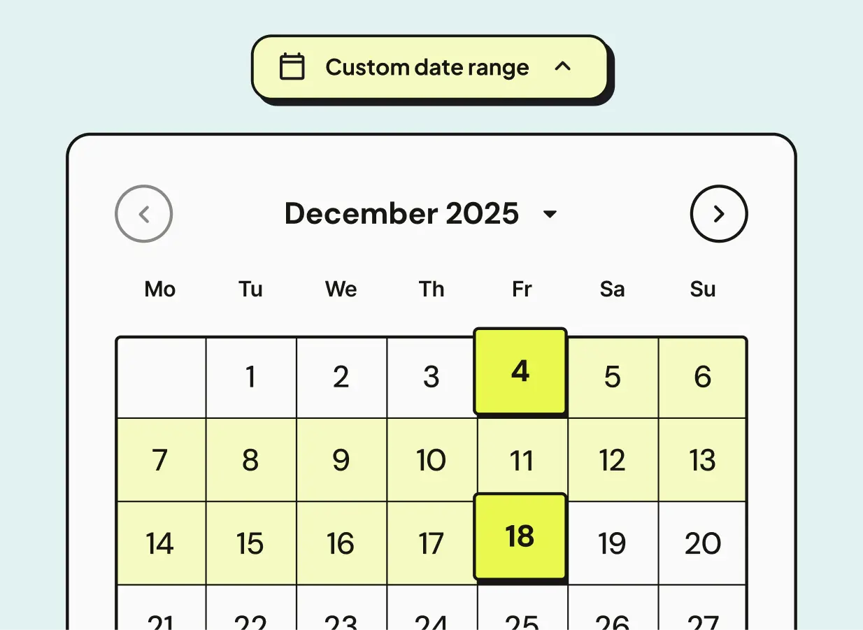
Various UI from the analytics page.
Iterations on a card showing performance by question types. We landed on a toggle view showing both percentage and raw number, as answer type frequency varied widely and a single wrong answer could skew the data for a rarer type.
Turning an answer review backlog into a manageable process with small, frequent wins
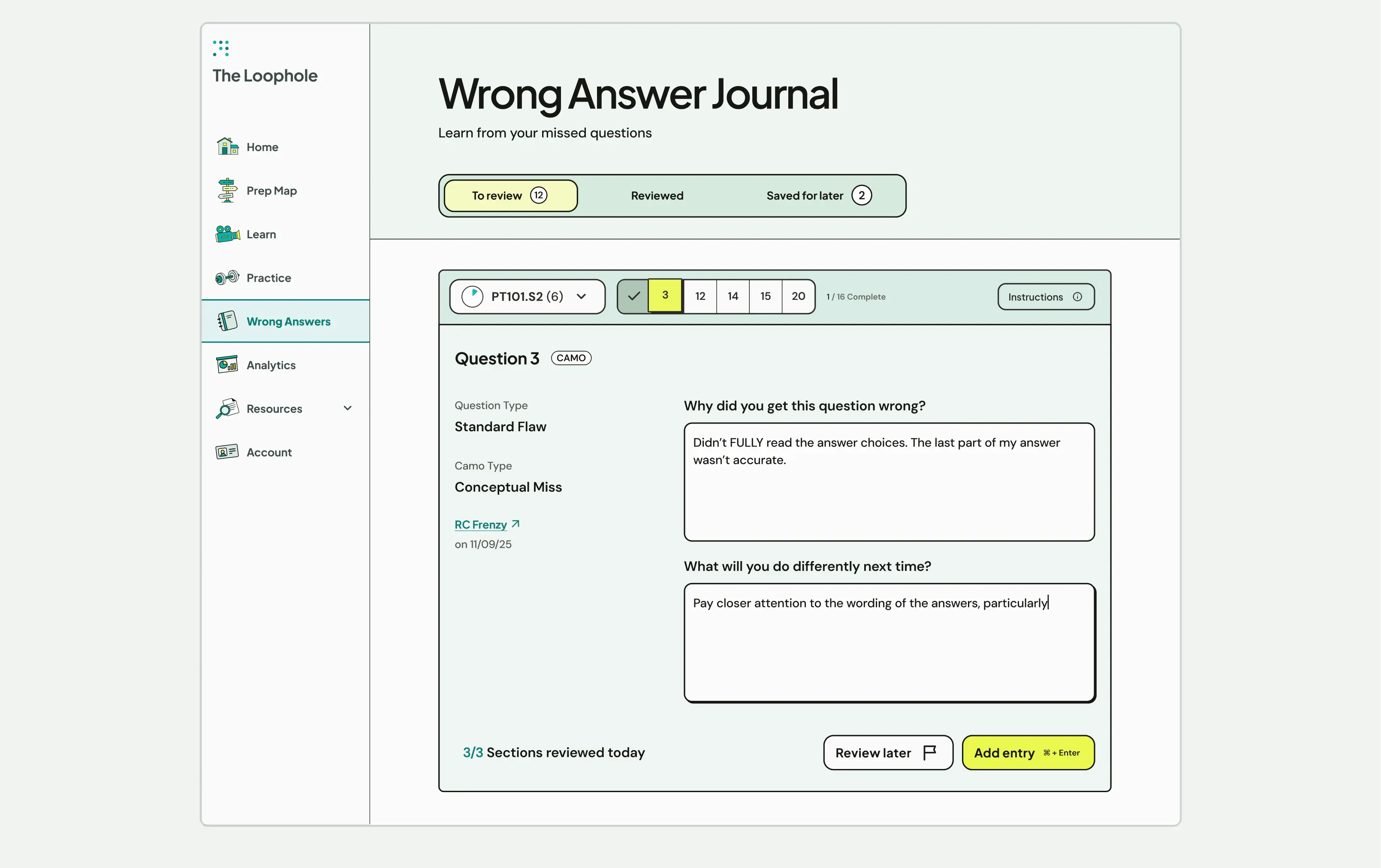
Students were tracking wrong answers in spreadsheets, but when they fell behind, the amount of questions to review became overwhelming. We took inspiration from flashcard apps, which break down a large study set into smaller rounds, to create a system that frequently gives students a sense of completion.
04
The interface focuses on one question within one practice exam section, keeping workloads manageable, while a daily goal encourages regular review.
Outcome
A strong launch for the new online experience, with more features on the horizon
After an initial launch in April 2026, the Loophole team continues to use our core feature set and scalable design system to expand well beyond handoff.
Separating design flaws from subject matter complexity
The LSAT is its own world, with processes, terminology, and concepts that looked confusing from the outside but made perfect sense to students. By studying the test structure and leaning on the Loophole's expertise, I made informed design choices that improved usability without undermining the teaching method.
Continuously improving communication through weekly retros
Clear communication is essential in any successful project. So when we noticed workflows slowing down, we started weekly retros with the client. By addressing the friction, we were able to reduce revisions and more accurately reflect the client's vision.
Keeping handoff smooth and accurate despite a development team across time zones
Live syncs were rare with a development team based in Europe, so it was cruical to make handoff clear, especially in a project where the visual language was so distinct. Detailed specs, Loom walkthroughs, and regular QA of the dev environment ensured the build held true to the design without slowing down the process.